What do you want to extract? gendata.m %% displaying numbers is not very helpful
%% displaying as an image is nicer (image, imagesc)
%% sorting first can reveal patterns
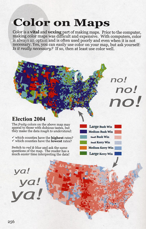
color maps
color maps
-- emphasize different things
-- continuity
-- if may be printed in b/w should work that way too
colormap info
In matlab you can make your own colormap -- just define a 3 column matrix and you can use it as a colormap. You can also use the colormap editor colormapeditor
e.g.
gmap = [ 1 0 0 ; .8 .1 .1; .7 .1 .1; .2 .1 .1; 0 .5 .5; 0 1 1]
colormap(gmap)
colorbar
rgbplot(gmap) %%% gives another view of the colormap
load('topo.mat','topo','topomap1');
rgbplot(topomap1)
%%%% (type earthmap.m) What do you think of the use of these colormaps?
click on Lie Factor and then Goosed up Graphics Hinton Diagrams
size (area vs length) hinton diagrams
hintonw([AA(Idx==1,:); AA(Idx==2,:); AA(Idx==3,:)]);
hintonc([AA(Idx==1,:); AA(Idx==2,:); AA(Idx==3,:)]);
colorbar;
 What is better here?